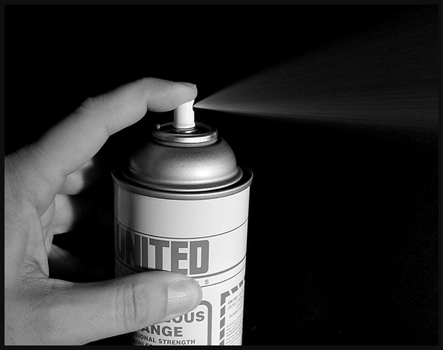
I suspect this shot may not score as high as some others, but I think it captures the theme very well. The shot is technically well-done and no one ever said a photograph had to be "pretty" to be "good". Very nice!
I like the lighting effect and the BW. I would have turned the bottle a little bit so we can see what is written on it, or turn it the other way to hide the partial writings. Great picture overall.
Decent lighting (a huge compliment in itself), and intriguing for the use of black and white. There's something almost blatant about this composition - like you haven't been distracted by any possible suggestions of 'boring' and just gone for it. One point: in order to see all of the spray, I have to lighten my monitor so all the top five squres on the chart blow out - could curves have helped bring that out a bit more? Or perhaps more light in just that area?
Crystal clear, great contrast. Looks like a stock photo. Putting a piece of white paper around the can to avoid the distraction of the words might have helped this slightly by increasing the stark simplicity.





 Add photograph to your favorites
 Add photographer to your favorites


 Photographer found comment helpful.


