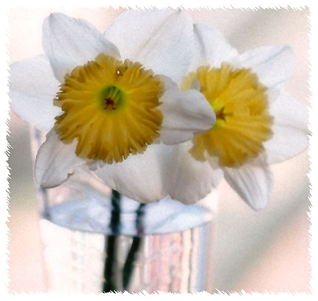
It seems like people either loved or hated it lol. No biggee. It was NOT out of focus when it was taken nor did I even sharpen it.After editing it this way it reminded me of a greeting card or something. I liked it and that's all that really matters. Thank you for all the comments. They are always helpful- well most of them lol.
Nice composition and muted colors. The glass of water really draws my attention away from the flowers, maybe because it's brighter and has more contrast with the dark stem.
Right then, joke's on me as I now have to plough through 564 images and bump them all (yes, all of them) up. There'll be a third run through for fine tuning. It's day two now and I'm running late, sorry.
Picture is blurry and I really don't think I like the border. The lighting in the mail flower isn't right. I think it needs to be brighter to stand out. It looks like you have maybe added some image grain and IMO image grain doesn't look good with still life shots. A couple more things, there is a white dot on the middle of the flower that is some what distracting. The other thing is, they look like they are dying.
Pretty flowers but I think you oversharprned it to try and fix an out of focus photo. It is grainy and noisy and not appealing. Your border does not add to the photo, sorry.







 Add photograph to your favorites
 Add photographer to your favorites


 Photographer found comment helpful.


