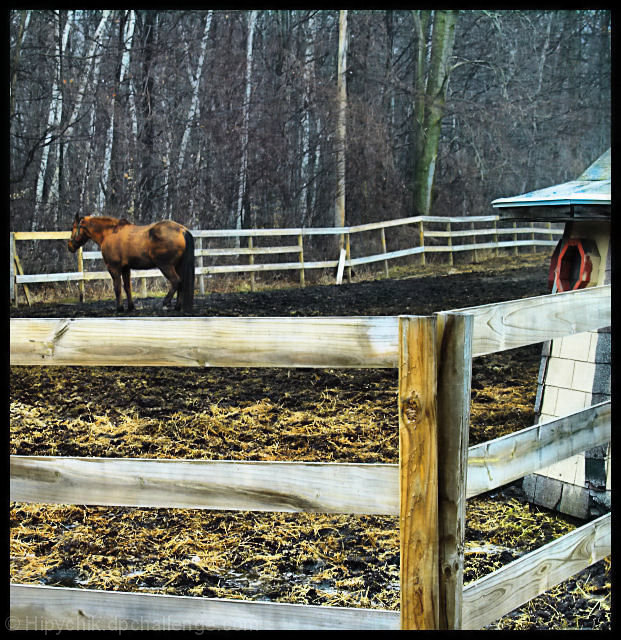
I kinda like the triangular composition, created by the triangle of the fence to begin with, then the horse then the building. In my uneducated opinion, cropping a bit off the top helps strengthen the composition.
I like the color tones, and the atmosphere is really cool. Maybe the problem was a lack of composition... there isn't a good emphasis on the subject. Something that would probably really help out is if you cropped out the distracing building thingy (whatever it is) on the right. Also, the focus should probably be on the horse, not the ground.
Other than that, this photo looks like it has good potential... I kind of like it! :)
The exposure and texture of the fence is wonderful. If this is the main subject then the horse and trees in the background are unnecessary.
If the horse is your main subject the the foreground fence is a big distraction. It also acts as a barrier to the rest of the image. The horse in this case needs to have more detail and the fence needs to be less prominent.
The color and texture in the foreground fence are great. Overall the image seems a bit awkward though. Maybe trying it again (if possible) and leaving the structure out on the right would help a bit.
I like the feel of this picture. I may have liked it better without the little building on the right and the post anchoring the left side of the photo.
Right then, joke's on me as I now have to plough through 564 images and bump them all (yes, all of them) up. There'll be a third run through for fine tuning.
Looks like one of those surreally-lighted HD thingies. Good and not good at the same time. There's a lot of calm in the lighting and form of the background, but an unnecessary (to my eye) contrast of busy-ness in the foreground. 6
I really dont know what this pic is about. I see a horse and a fence which crosses the pic and distracts you. The building to the right is not helping as there isnt enough of it. I gave u a 3.







 Add photograph to your favorites
 Add photographer to your favorites

 Photographer found comment helpful.


