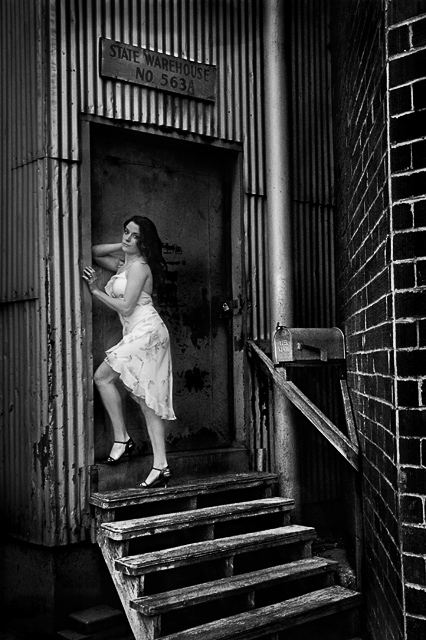
I tried cropping, but for some reason didn't like any of the crops. I guess I kind of like the entire picture, with the stairs, mailbox, sign and brick. I did lots of selective levels, a bit of shadow/highlight, sharpen, and toned down the brightness to add a viniette.
greatly improved shot with this edit. well done. the stairs now add interest and lead us to the model. the negative space is now active, instead of the rather deadening effect it had in the origianl. nicely done!
Very nice job bringing out the subject and the textures. I agree it doesn't need to be cropped. You might want to try pulling the right side a bit more vertical with the skew tool - totally up to you, though. It really looks very nice as it is.
I really don't think this needed any cropping. Everything in the picture works without it being too busy. I love all the horizontal and vertical lines everywhere. You did a great job lightening the dark areas and improving detail overall. She doesn't seem as sharp in the edited version, but that's the only critique I have. Nice.
looks a lot better. nice editing job. don't know if you highlighted the model, but there's a few 'light' spots around her i didn't notice before. but overall, much better, good work!
wonderful processing on this image - the contrast and brightness on the model work very well. I am torn as to whether a slight rotate to make the brick wall perpendicular would help - but then maybe the model would not be aligned correctly... still I really like the PP you did on a pretty cool image.
great result .. be good to put the unedited in the post with the edited so we can compare ... or as a thumb in your photographers comments ...
love the contrasts in this and think its great without a crop, coz i like being able to see the stairs and above the door ...




 Add photograph to your favorites
 Add photographer to your favorites


 Photographer found comment helpful.


