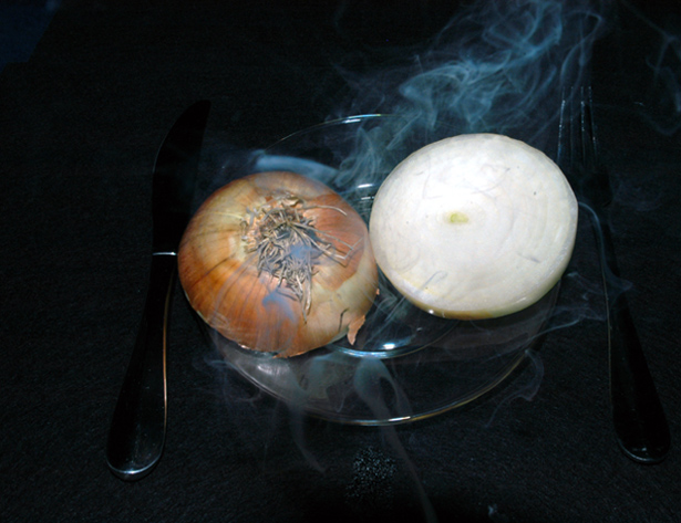
OK, I see what you were going for here. But, the lighting makes it tough to figure out exactly what's going on here.
As for composition, I think you should have made it ovbiously off-centered, or exactly centered. Either would have worked, but this barely off-centered thing here makes it look like an accident.
Finally, as for the smoke, it is a great idea, and very well captured. Unfortunately, it starts from below your image, so it really just looks like smoke from an unrelated source.
This is... just... absolutely wrong on so many levels, but very funny. I do wish the flatware was more obvious against the background -- or that may just be lighting issues -- as you really want to call some attention to it given the joke. And while I know the mantra is "centered is bad", in this case, the off-centered-ness does not strike me as the best choice.






 Add photograph to your favorites
 Add photographer to your favorites


