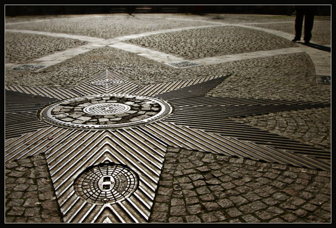
This is still in color. And yes, the original was in color, too. The angle of shooting into the sun and the fact there wasn't much color to begin with makes it appear monochrome.
Cropped and rotated. Duplicate layer, multiply blending mode. Another duplicate layer, color balance at +29, +10, -25 on the midtones. Flattened. Duplicate layer with gaussian blur, then erased starting with brush at 100% in the front, and gradually decreasing the strength of the brush while moving back in the picture. Sharpened using a duplicate layer and high pass filter with soft light blending mode, with a high setting - 36 pixels. Resized, added border.
This was a good shot to begin with, but the editing has really brought out all of its good elements. (I refuse to "say" the word "pop".) I'm glad you left the legs -- they add the quirky grace note.
You made a gem from a rough stone with this one. I need to learn about layering in order to present some of my images in better fashion. I like images with geometric shapes, and this one is full.
Interesting - I did not think this was a color photo. An optical illusion of sorts. I like the mixture of textures a lot, as I did in the original, and I think the feet are an important component for adding scale and context - so I'm glad you didn't remove them. The brights look a little too bright on my monitor and trap my eyes in the star area - but it may just be my monitor. The one thing I would consider, aside from dimming the brights just a notch, would be to clone out the two shadows or cracks toward the very back that break the line of the arc. I think they detract from the continuity. BTW - I did notice you straightened this - and am glad, as it looked slightly skewed to left before.
excellent result with your editing deb ... the different hue really works .. i must'v missed the unedited version when you posted it ... i love the different patterns & i really like the composition with the off centre star .. the refected light is great ..





 Add photograph to your favorites
 Add photographer to your favorites


 Photographer found comment helpful.


