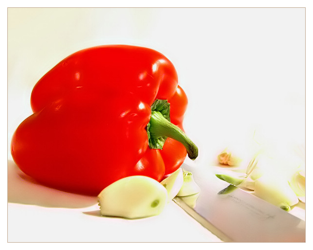
this is a beautiful picture, but to me parts of it are overexposed; I think it would have looked better if the surface it is on, and the background were a color other than white to give better definition to the parts that seem to blend
The right side just above the knife seems very blown out/overexposed/too bright. A lot of the details there have been lost. Because of that I'm not really sure about the composition, although the knife would be the leading diagonal line from the corner to the pepper that seems to be the main focus. With that in mind I wonder about the reasons for the garlic cloves. The red of the pepper is very vibrant.
A very good idea, and a great looking red pepper! Your lighting is too harsh though, especially with a white background and white garlic. It might have been better with a black background? The white, red and silver would have stood out more I think.
I really like the comp in this one... a different take on garlic. Like the DOF, too. Would have been an 8 with a few less hot spots on the pepper - 7 as is.
too much glare on the right side, should have used softer lighting - so that the shadow wouldnt have come on left.
other than that the colour and evrything else is in place
Pretty pepper. I like how you arranged it with stem looking down into the kife. The chopped garlic and the knife tell a story about cooking and preparation for a yummy meal, makes me think of aroma! the colors are fine, I think larger DOF, and a bit less bright..
Good clean image with seamless background. Uout of balance because the garlic on the right is overexposed, hardly visible against the background, and the red pepper takes all the attention.





 Add photograph to your favorites
 Add photographer to your favorites


 Photographer found comment helpful.


