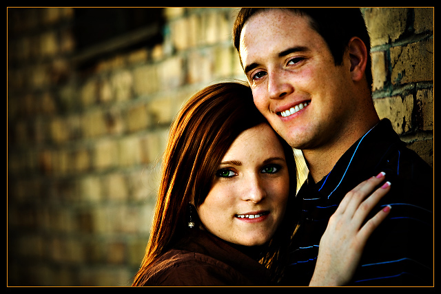
all those beautiful warm tones - and her JARRING pink nails just smack you upside the head! Can't be helped though - looks like she paid a lot for that pink.
Overall this feels too processed to me. It's left photography and approaches illustration. A neat trick no doubt, one that I can appreciate in other applications - but doesn't work for me here. 6
I like the framing, composition of this. Depending on what kind of look you're going for. Personally I think romantic (if that's what you're going for) photo's look better with less contrast...softer. My personal choices doesn't effect my scoring. I think the photo is very nice. 9.
I really like this shot a lot. The composition and balance of the subjects are very nice, and the background is appropriate with beautiful bokeh. I also like the contrast on the model's faces; it really adds some depth to the shot. Somehow her eyes feel just a bit too oversaturated for my tastes... I know many voters here seem to love that extremely pure tone, but I feel it's a little unnatural and actually on the side of feeling over processed for me. That being said, I think my biggest gripe is actually not the photo itself but rather the border; while I feel the thin band of color is simple and appropriate to use, it feels a little warmer/saturated compared to the bulk of the rest of the picture and I would rather the subjects maintain the focal vibrance. That in no way has anything to do with the actual photograph, however, and I'm not going to let a border affect my rating; just an impression I have of the overall presentation. Great job.







 Add photograph to your favorites
 Add photographer to your favorites

 Photographer found comment helpful.


