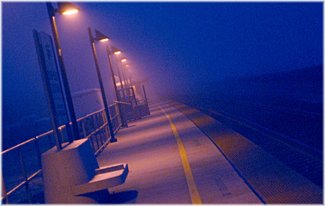
Hi Kristin, wow, this one is superb. Great eye on this one. I think you got hosed on your score. This should've scored much higher. Keep up the great work and I hope that we get a chance to shoot together one of these days.
Oh, you were robbed! I was one of your 10s; loved the angle and this was one where I thought the grain really enhanced the overall look and feel of the image, rather than just being an added feature because it was a "grain" challenge. Nice job.
This one is only OK for me, dawg. There's just a lot of chroma noise that seems to be in this one, like in the shadows on the platform between the lighted areas.
I wish you didn't find it necessary to include your ISO on your title. The graininess certainly enhances the fell here, and the tilt of the image adds a dynamic that's effective. It could perhaps use more contrast - a stronger sense of the dark, and for a really effective image I would say it is too cluttered along that line of the lightposts - the signs, the seats, the vehicles, the buildings confuse the sense of simplicity that exists in the right side of the image.
Bleak & lonely. I love the lines & the way the light falls to the platform. Without the tilt this would be a more ordinary shot, the tilt adds a dynamic feel. Grain in colour usually hurts my eyes, but you've got it just right here. Wonderful shot!






 Add photograph to your favorites
 Add photographer to your favorites



 Photographer found comment helpful.


