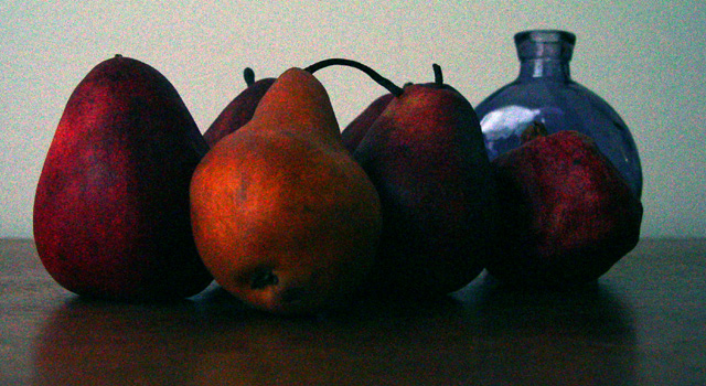
i like the effort on this photo - but the colors seem a little washed out to me and the grain on the fruit and in the background has a greenish and pink hue to it
Don't think the grain improves this still life. It makes the fruit look unappetizing. I would like the composition better if the pomegranate(?) wasn't covering the blue bottle. I think the bottle is the most interesting thing in the shot and the blue tones of the wall complement it nicely.
I like the idea of this. I'd pan back and not have such a cramped crop. I think it would really work well in sepia as well. As it is, all of the RGB colors are showing up against the light background and it looks like tight confetti.





 Add photograph to your favorites
 Add photographer to your favorites


 Photographer found comment helpful.


