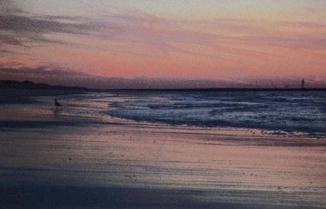
Personally, I don't usually like colour with grain, but this one works really well with the blue and purple hues. I would suggest a shift in the horizon though, either higher or lower, depending on whether the sky or foreground was the most interesting as I feel it is too close to the centre of the photo.
Reminds me of Seurat. Both the colors and the texture. Seems to have a little horizon tilt (left is lower to me) I'm not a big score killer b/c of crooked horizons, I know they can be deceiving. Very nice image, overall.




 Add photograph to your favorites
 Add photographer to your favorites


 Photographer found comment helpful.


