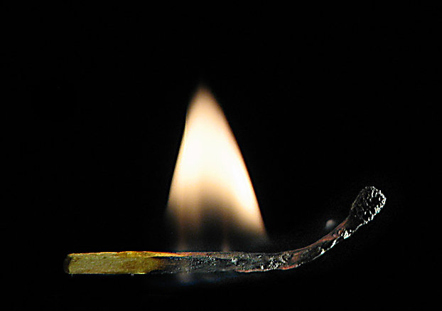
Most of the high scoring match shots have pretty vivid colors(at least as I recall). Yours seems more muted. I like the detail on the burned portion of the match, but not crazy about its placement in the frame. Maybe the lighting is a little harsh on the burned part of the match but not a big negative IMHO. A slight tilt of the match might have been a better choice.
I'm sure some of the low votes are the result of literalists not seeing the clock in the upper LH corner ;)





 Add photograph to your favorites
 Add photographer to your favorites

 Photographer found comment helpful.


