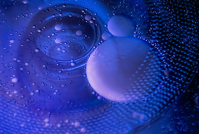
Flipped the lid of my crock pot upside down, poured some water in, dripped some food coloring in, poured some vegetable oil in, stirred it up like crazy. One shop light bottom left (angled and diffused with tissue paper).
Shot in RAW: adjusted white balance
PS:
Crop
NI
Curves
Brightness/Contrast
Hue/Sat
Selective Color
Duplicate background layer, Hard Light blending mode, reduced opacity
Duplicate background layer, Color Dodge blending mode, reduced opacity
Duplicate background layer, lots of dodge and burn
More NI
Resize
Sharpen
Save for Web
Statistics
Place: 58 out of 283 Avg (all users): 5.9167 Avg (commenters): 7.7143 Avg (participants): 5.8090 Avg (non-participants): 6.0909 Views since voting: 1068 Views during voting: 236 Votes: 144 Comments: 10 Favorites: 1 (view)
A good photograph in any genre will score well in the right challenge.
Positives:
Overall general quality is good and the blue as a duotone works well. The viewer may not be able to figure out what it is, but it looks interesting and that is all that matters. It has a 'spacey' feeling to it.
Technicals:
As was said, quality and blue tones work well. Composition generally OK. Lighting and exposure are good. Nothing really bad here.
The challenge:
It fits the challenge and meets it in an unexpected way and probably contributed to the higher than expected score. And, of course, anything done well SHOULD get a good score even though they often don't. In your case you were not punished for DNMC and that is why you got a better than average score.
Suggestions:
You might consider cropping smaller to get rid of the lower right corner. That would add to it's overall 'spacey' feeling. Apply spot sharpening to the lower bubbles... they are on the soft side and incompatible with the rest of the image.
With the simplicity of the subject and relative uniformity of color, this could have been a very boring shot, but I think the variety of circle sizes and asymmetry of the composition makes it effective. Although I like it as it is, I wonder if it could be improved by having more "happening" on the far right side of the frame - maybe it could have benefited from a slight crop on the right side?





 Add photograph to your favorites
 Add photographer to your favorites

 Photographer found comment helpful.


