Overall, this is an excellent photo and true to the challenge topic.
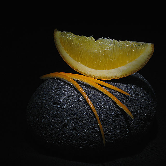
The composition is excellent. I think I would have left less space at the top, which from scrolling my window to simulate it makes the orange stand out more, to me at least.
The lighting is very good. There's a bit too much reflected light on the edge of the orange, and on the closest peel on the rock. I think a slight backlight on the orange might have made it's color sparkle on the main surface more than the edge. A fill light on just the orange might have worked too without spoiling the interest and mood of the way the light falls on the rock. Otherwise, you might have played with lower lights and longer exposures (and subsequent noise reduction) to achieve a non-reflecting exposure.
Aesthetically, this is a very nice photo, that will work beyond the challenge, perhaps with some postprocessing that wasn't allowed to achieve some of the cleanup mentioned above and whatever else you wanted to do artistically.
The crisp finesse of the arrangement is both apt and tangibly delicious. The various technical givens in this shot demonstrate a high degree of skill and accomplishment.
For a photograph (and a studio shot at that) of this calibre I\'d prefer to see a more standard format, either vertical or horizontal, especially since there appears to be no compositional reason for the very static square.
I rate this examplary image 8 (on a personal scale, mainly because of the limited range of both subject and topic). Within the context of DPC, it is a 10, no holds barred.
This is lovely and the lighting and textures a very nice. For me there is too much negative space on the left as you look at the image and a crop would have strengthened the whole effect.







 Add photograph to your favorites
 Add photographer to your favorites

 Photographer found comment helpful.


