Post-challenge:
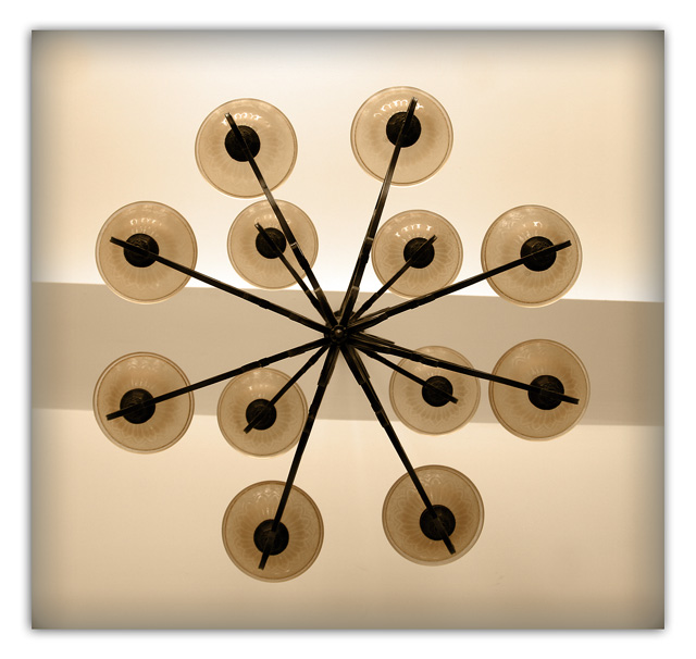
This is a shot of the chandelier in my living room (I just placed the camera on the cofee table). I know it has many faults - actually I've just submitted it to see how it would look and I forgot about the submission deadline date and there you go! I was planning to take a better shot (with the tip in the center, sharper, etc.). In fact it did better than expected - no 1s or 2s and just one 3? That's a new personal best ;) Thank you for the comments, they are appreciated.
Statistics
Place: 167 out of 283 Avg (all users): 5.3040 Avg (commenters): 6.7500 Avg (participants): 5.3000 Avg (non-participants): 5.3111 Views since voting: 913 Views during voting: 182 Votes: 125 Comments: 5 Favorites: 1 (view)
in general I like this idea and shot. the only thing that is a bit distracting is that the center stip of colour is not level or evenly placed in the center of the lights.. 6
i like the tones on this, but the vignette around the outside of the image does not work for me - I would have preferred a sharp border around the image instead. Still, its a good image 7
I think that if the line were straight across the photo rather than slanted it would prove to be a much stronger photo. The border is also lessening the impact with the blur. I think no border or a 10 pixel black border would really give this photo punch. The colors are nice.






 Add photograph to your favorites
 Add photographer to your favorites


 Photographer found comment helpful.


