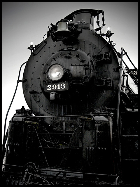
i like the black and white tones very much, gives the train a deep sense of oiliness and grease that is somehow fitting. i can see it fits the challenge, though i think the angle of the train, and the crop makes it all sit a bit uncomfortably. the sky seems a bit odd; probably result on unfavouraly dull weather conditions, but it might be worth aplpying the burn on mid tones and highlights to make it feel a little less graded. the engine itself is nice and has character.
my first weighted scoring system™; composition + technical 1/3, challenge 1/1, post processing results 1/2, ooooh factor 1.5/3, originality .5/1 = 5 |







 Add photograph to your favorites
 Add photographer to your favorites


 Photographer found comment helpful.