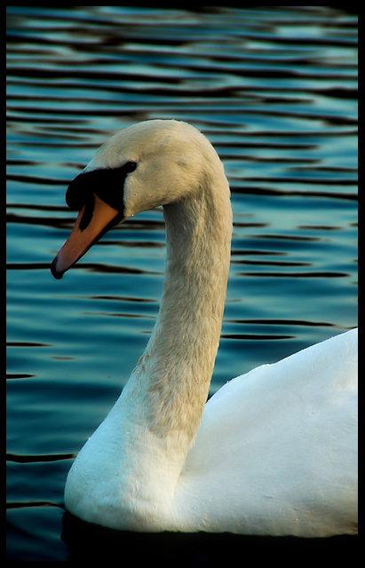
This is one of my lowest scores. I was expecting this to do better. On my screen anyways, the gradiant in the water bottom up looks really good. I got a comment (out of THE FIVE hahaha) that says it's too dark. I don't get. I saw this on two other screens and it looked fine. Hmmm. Oh well.
Statistics
Place: 437 out of 561 Avg (all users): 5.1351 Avg (commenters): 5.5000 Avg (participants): 5.1636 Avg (non-participants): 5.0526 Views since voting: 916 Views during voting: 222 Votes: 148 Comments: 7 Favorites: 0
May I make a suggestion? Please don't take it as criticism, but I've take an few shots of mute swans, and I find that if you boost the colour saturation the neck seems to change to a pleasing bright yellow. I think if that if the cropping were a little less boxed in and the water ripples (which are very nice BTW) were level, it would make a lot of difference. On a brighter note, this shot seems to have some sort of a "purity" to it. I'm not sure how to better describe it, but I like it.
I think it's the darkness of the head area that gets people saying it's too dark. People expect swans to be pure white (not that they really ever are). The result (on my crappy laptop montior) is the eye get lost. The crop is nice, but I think it's a bit tight. My .02€
Nice focus and good job with keeping the details in the whites. Looks a bit cool, though - I think you could ramp up the exposure 1/2 a step and make this pop a lot more.
Right then, joke's on me as I now have to plough through 564 images and bump them all (yes, all of them) up. There'll be a third run through for fine tuning. It's day two three now and I'm running late, sorry.
Well, I have to be honest, the shot doesn't really appeal to me. I'm not sure if its too dark or just not as clear as I think it should be. Maybe its the subject. I have to go with a 6.






 Add photograph to your favorites
 Add photographer to your favorites

 Photographer found comment helpful.


