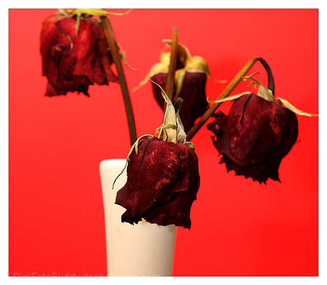
The roses look very natural, and have a good color and nice focus and lighting. The background and vase seem too flat, and the color doesn't enhance the roses. I think the image would benefit from more room at the top.
I really like this concept, colors are bold and detail is very good. However, the vase is a very powerful element and steals some of the glory from the roses.
The sharpness of the central blossom is quite nice. It captures a lot of good detail and creates good foreground interest. The depth of field applied to the overall picture works and help create three dimensional space.
The background color is a little distracting. Perhaps a slightly darker shade of red would help.
The border is a little thick and detracts from the image. The rose hip on the right side is kind of "stuck" into the frame. It would be nice to have a bit of separation.
While there are many roses shown in this challenge this one takes a unique approach with the dried blossoms.







 Add photograph to your favorites
 Add photographer to your favorites


 Photographer found comment helpful.


