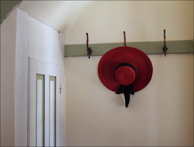
I'm another one of those who didn't vote in the challenge, but this was my favorite. I agree with the comments about composition. Maybe getting rid of the door and centering the hat along the upper third of the frame would help. At any rate, it was a good idea, and I really liked it.
VEry nice. I agree with the composition suggestions to really perfect the shot. But it is still lovely the way it is too...I gave it a 9 during voting.
Nice composition, probably I would crop the upper part of the photo till the edge of the door letting the heat going near the upper third of the composition.
This is actually the only photo in this challenge that grabbed my attention enough to vote on it. Love the subject and idea, but the composition is a little lacking... the hat is centered vertically and sort of in-between center and 1/3 right, which isn't very pleasing. I would like to zoom out a little and place the hat one hook right, then align the picture in 1/3's; maybe have the hat hat 1/3 down and 1/3 from right, door&wall cover left 1/3.







 Add photograph to your favorites
 Add photographer to your favorites


 Photographer found comment helpful.


