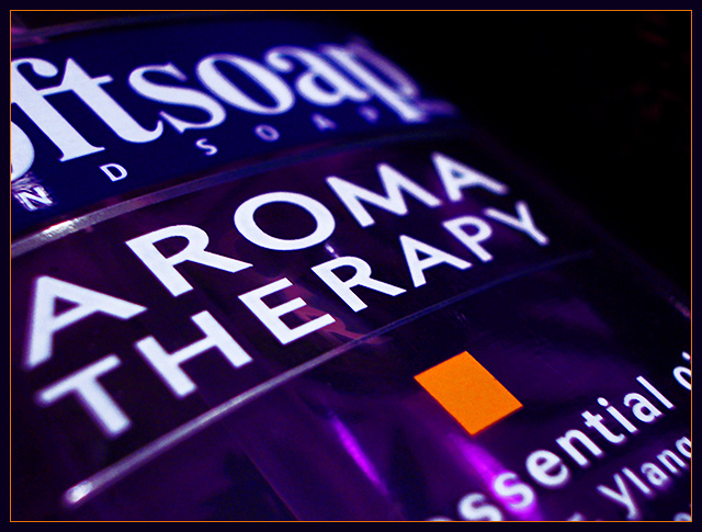
Soap dispenser, purple towel for backing, to fill in gaps in the scene. I like the juxtaposition of the orange square within the sea of purple and text - I feel it provides a balance and a counterpoint in these secondary colours.
Handheld, in supermacro mode. Processing was quite simple, selective colour adjustment layers to remove spot noise, some sharpening, some noise reduction - the usual.
Statistics
Place: 99 out of 188 Avg (all users): 5.1164 Avg (commenters): 6.4545 Avg (participants): 4.9239 Avg (non-participants): 5.2429 Views since voting: 1251 Votes: 232 Comments: 12 Favorites: 0
What?! 101st place?! That's insane. Just because the subject was a simple household item? This is one of the better shots in the whole contest. Take a look at some of those shots that scored higher...why?
Such a simple photo but a strong photo. You took an everyday item and made an image that could easily be used in advertising. I wish everyone could do this. (I'm tired of snapshots!) I love the use of black in this shot. The purple and orange work well together as well as the border. The only thing I'm disappointed about is the heavy blur on the 'a' and 'p' but I don't think there was much you could do to prevent that. Super shot. I gave this a 9.
I'd prefer to see the soap itself or some bubbly lather rather than the lable on the bottle. You do get a nice color, and managed to minimize reflections. The narrow DOF shows the curve of the bottle too.





 Add photograph to your favorites
 Add photographer to your favorites


 Photographer found comment helpful.


