Challenge:Pencil (Classic Editing) Camera:Nikon Coolpix 880 Location: USA Date: Aug 18, 2002 Aperture: Not Listed in EXIF ISO: Not Listed in EXIF Shutter: Not Listed in EXIF Date Uploaded: Aug 18, 2002
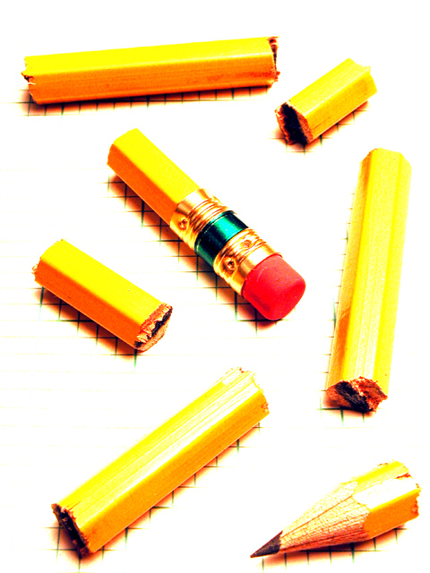
This is a pretty neat idea, and really nice placement. The focus is very nice, but the post editing is way too exaggerated, in my opinion. The pencil parts don't look natural and the lack of background except where the shadows were suposed to be is kind of distracting. I am sure you did this on purpose though, so I will hold this a just my opinion and say that if you were going for this look, then you definately did your job. Original and pretty creative. Good luck with the challenge.
Pretty neat. I love how the pencil shadows keep the pattern on the graph paper showing. Maybe a little too blown out and harsh looking but i like this overall. Lisa
Love the cross-hatching beneath the pieces of pencil. Is this hand drawn just where we see it, or is the whole paper gridlined and the contrast set up high to get rid of it? I like this a lot, but the layout of the pieces doesn't quite gel for me. 6, Kavey
I love the "How" presented here much more than the actual end result. The process what you did though is great. And so are the clarity and sharpness. 6 Journey.
On any other site you might get a "creative effect" comment. On this site you get a "cooked the levels a bit too much" comment. But in my opinion you get a place in my top ten this week.
Very nicely done - I love the exposure effect. Must admit, it's sort of hard to look at for a long period of time - but I love this. Great composition and detail. abstractish Excellent work 10 Ruthann One of my top 2 favorites!!!






 Add photograph to your favorites
 Add photographer to your favorites


