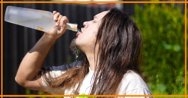
I'm not bothered by a basic black or white border, but the orange edging you've got here really detracts, imo. I understand, though, that you were trying to pick up the color from the writing on the bottle to help it pop.
I get your point, but I think that there were so many good ideas that portrayed alternative medicine in a positive manner. This one just isn't working for me.
Interesting image, not really sure how to take this one. It feels just like a snap shot and doesn't give me really a ton of feeling. Just some guy drinking.
You probably should have turned the bottle so it was obvious what he was drinking (alcohol vs. water) also the background is pretty distracting here and the lighting on his face is too harsh. Good idea though... keep working with it.





 Add photograph to your favorites
 Add photographer to your favorites


 Photographer found comment helpful.


