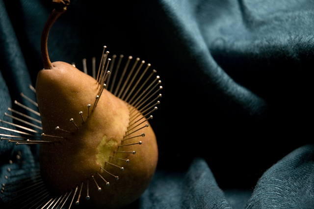
Inspired by aimeethetoo's "Prickly Pear" from the Still Life II challenge
As Camera RAW:
white balance, tint, exposure, shadows, brightness, contrast, curves,
As JPEG:
sharpen, sharpen more, hue/sat, resize, save for web(twice 'cause i didn't pay attention to the file size the first time[oops])
The dof is too narrow, and the focus is kinda soft. I like the idea somewhat more than the way the photo turned out, but figured I'd submit it anyway. I'm guessing it'll get 4.5-5. Also, I've been in the habit of doing fairly highly saturated photos or completely black and white so I thought I'd try something in between for a change.
Statistics
Place: 25 out of 131 Avg (all users): 6.0262 Avg (commenters): 7.0000 Avg (participants): 5.6226 Avg (non-participants): 6.1262 Views since voting: 1249 Views during voting: 437 Votes: 267 Comments: 21 Favorites: 1 (view)
i like how the pins create movement in this photograph. the lighting makes it more interesting and highlights the heads of the pins for a cool effect. nice job.
Now thats a Prickly Pear. I really enjoy the design you made here. The spiral really creates more intrest. However, that spot distracts. I also think a wider dof to where the whole pear is in focus would have been nice and allow the background to fade. Missing the tip of the stem distracts me.
this is an interesting and compelling image, but after my initial "cool!", I am thinking: OK, what's the point? what is this saying? why a pear? why a spiral of pins?
this is pretty, buti dont really like the side of the pear you choose to show, it has some sort of color changed in the center, its bothersome and distracting...






 Add photograph to your favorites
 Add photographer to your favorites


 Photographer found comment helpful.


