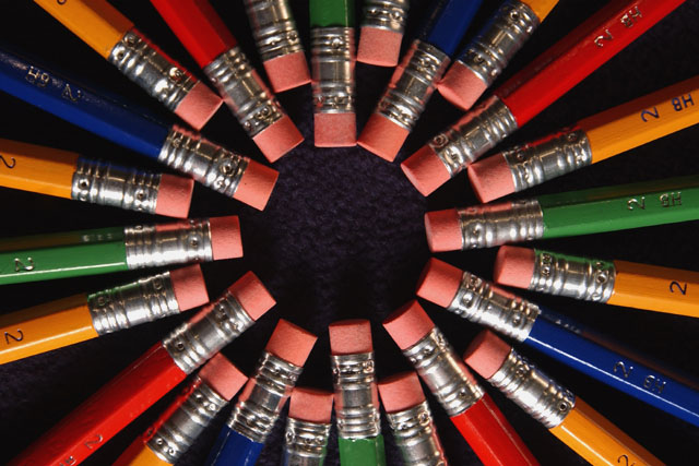
I like the pattern, design and color you achieved here. I think I would like it better if either all the writing were showing or none of the writing were showing. The very bottom pencils look a little distorted and the focus is a bit off. The dark background is a nice contrast. =6 syamjonimi
Hey that blue pencil in the centre ring on the left is out of whack! Haha just kidding :) That's a great idea and very symmetrical! Maybe they could all have lead to something in the middle (no pun intended) 8 BigSmiles
Visually impressive. Nice color arrangement, great lighting, and in general pretty cool. That darn blue pencil to the top left snuck out a bit farther than the rest, as did the green pencil directly at the bottom. But you know what, I tried something like this, and it was hard to get it perfect, especially when you are only going by eye. Not sure if you were trying to center it perfectly, or offset it on purpose, but if you were trying to get it centered, it should go up slightly and to the right. Great shot and good luck with the challenge.





 Add photograph to your favorites
 Add photographer to your favorites


