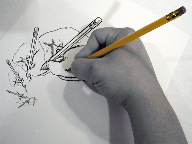
This is a really great concept for this challenge. This reminds me quite a bit of the MC Escher stuff... My only complaint about this image is that the desaturation did not work well overall. There is still some yellow left in the skin that makes it look awkward. With this in mind, I would possibly have tried another avenue of post processing... (just my opinion though :) ) Good shot! = 7 - jmsetzler
I really like your composition; it's quite imaginitive. And, I think using levels to bring down the saturation, and thereby emphasizing the yellow pencil is a good idea. But, I do think the subjects arm and hand tone shows too much mottling color.
Excellent drawing - but as a photo it doesn't appeal to me. I also think you should have added some light from the left to lessen the shadow. Furthermore - a different color pencil would have made it possible to have the hand in greytone only (rather than those strange yellow freckles) but perhaps it's intentional. 4.
I really like this shot as it has excellent creativity and very good composition. My nitpick is with the lighting and resultant multiple shadows. I think that a well diffused light source and possibly a fill-in from the left might have improved this.
Nicely Escheresque! I wish had your drawing talent. The use of color to bring out the pencil is interesting, but I think I would have preferred a straight black and white.
Great shot, wonderful drawing, interesting coloration of the hand (waffling on like it/don't like it). I thought about doing something similar, but didn't. (I can't figure out the words about giving credit to Esher, but something along that line might have been a nice thing to do.) 8 Swash
This is very nice. Lots of photos of pencils drawing stuff. The angle is great. I love how the hands seem to spiral down like that. I wish there wasn't a large shadow there. It's kind of distracting. Focus is right where it needs to be. Is there a reason for the lack of color in the hand? Nice shot and good luck in the challenge.
Nice image. It doesn't grab me though. I know why that is: I am well familiar with the dynamite drawing by Escher of the hands drawing hands. So, whether I want to or not, my mind immediately makes the comparison with that Escher drawing andyour image suffers in the comparison. Good execution and composition. Image seems very grainy, particularly in the hand and arm. 6 Journey
awesome, awesome, awesome. escher would be proud of you. i spent most of this week trying to figure out a photo of my drawing myself in a photo ... you get the drift. failed miserably. you took the concept and just did it perfectly. i'm not so sure about the selective desaturation because it makes the hand look a little spotty, but that's minor. you definitely have one of my top 5 vote this week. -- gr8photos (10)
You have an excellent idea here. Nicely placed/composed, and draws my eye in to follow the spiral and back again. The skin has a yellow speckle to it - perhaps over-saturated or over-contrast? Definately on to something though.






 Add photograph to your favorites
 Add photographer to your favorites


