This is one of those ideas that kept evolving as the idea I had before it turned out impossible to shoot. When three or four of my original ideas failed I ended up with this one. Mainly I wanted practice shooting against a white backgdrop because most of my studio shots to date have all been with a black backdrop.
My friends noted that I haven't submitted a photo for over a month (since winning my first ribbon) and they think I've let the ribbon get to my head. Not true! For weeks I have been trying to take a photo I liked but nothing has been coming out because I've been trying things too complex. This week I simplified things for this photo and by dang it I'm going to submit something if it kills me!
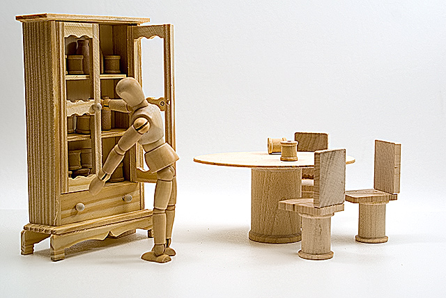
In case you don't "get it," the photo is supposed to show what woody's furniture would look like. DPC has had several woody challenges so I'm sure everyone is familiar with the "woody." I thought it would be cool to get a peak at woody's dining room furniture. The title "Unfinished" hopefully conveyed the idea that the furniture is all unfinished furniture (not stained, etc). I hope the title will help focus the photo on the furniture and not on woody. I'm afraid woody might distract from the furniture too much.
One of the little legs on the hutch broke off at the store and I didn't notice it until I got home. I used a block of wood under the back to prop it up and if you look closly you can see it looks really out of place. It stands out like a sore thumb once you see it. Also I tried to superglue the back chair together three times but the glue just soaked into the pourus wood and stained it. Again, if you look closely you can see the annoying stain on the chair from the saturated wood. I ended up using household Elmer's glue. I'm hoping the average voter who spends about 2 seconds looking at the photo won't notice the faux pas!
Statistics
Place: 90 out of 163 Avg (all users): 5.4127 Avg (commenters): 6.8750 Avg (participants): 5.3636 Avg (non-participants): 5.4464 Views since voting: 906 Votes: 189 Comments: 10 Favorites: 1 (view)
Not a bad set up. It is very over sharpened as evidenced by the halos around the chest and the texture in the side of the chest. Your seamless background worked well.
Hate, hate, hate, hate, hate Woodys, but oddly enough I kind of like this one. Very creatively done, and I like the lighting. Still hate Woodys though ;)





 Add photograph to your favorites
 Add photographer to your favorites


 Photographer found comment helpful.


