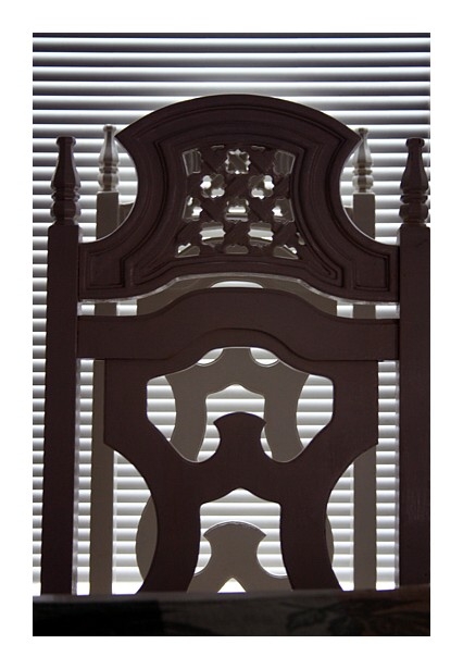
adjusted levels, color balance, cloaned-out a few spots, unsharp mask, resize for web. oh yeah, I added a huge border to draw your eye inward, much like using a mat when you frame you image.
Statistics
Place: 91 out of 163 Avg (all users): 5.4032 Avg (commenters): 6.3750 Avg (participants): 5.2877 Avg (non-participants): 5.4779 Views since voting: 754 Votes: 186 Comments: 9 Favorites: 0
Composition:This image is showing a different angle then most of the entries. I like the idea. The lines, curves and lighting are just fantastic. I would, however, remove the lower horizontal bar as it is out of focus.
Technical: Now this is where you were let down. For starters your image is out of perspective. Look at the right side. It is straight, but the left side is crooked. I have uploaded my version of your image to show you what I am talking about. And I will tell you what I did. I was working with your small version so it would probably have been much better if I started with the large version.
I started by using the crop tool and clicking perspective and lined up the two sides of the crop tool to the sides of your image. That then straightened the overall image and removed the initial borders. I also removed the lower bar. I then used Highlight/Shadow to bring up the beautiful detail in the wood. I then played with the Hue & Saturation and the Brightness & Contrast to get the punch in the wood. A run through with Neat Image and then I added a 1 pixel grey border followed by the 30 pixes white border.
Overall:This image has so much potential. I can seriously see this hanging in an office building in a large city. Run with it and don't give up your fantastic eye for detail. But please...apply that detail to the finishing areas of your work.
Unique idea, creative play on words & nice set-up! ...however, IMHO the blinds are distracting, especially in the finer wood working in the upper portion of the chair backs. I wish the chairs offerd more contrast, as is, the blinds seem more interesting.
Nice capture - love the idea - But images like these need to be composed perfectly to come off well and I think the cropping and off center balance flaws this image a little.





 Add photograph to your favorites
 Add photographer to your favorites


 Photographer found comment helpful.


