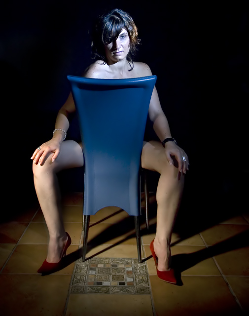
I do not like the harsh lighting to the top right. and her legs seem really soft. I also feel like the way her body is twisted distorts composition a little.. imho. 5
Great Idea and ok execution. for me I would have liked a few things fixed, less jewelry, watch etc, loose the feature tile at the bottom and perhaps two lights from th sides. It sort of looks like the top of her head was trimmed off but it could just be the lighting. Great Idea, good enough for a 7 from me. Good Luck
Nice capture - I like the lighting on the leg from the left - I think i would have preferred it also on the face - Looks like you have two lighting sources of different kelvins?
Is that chair leather? Looks plastic to me. hee hee I like the lighting. I'd remove the ring, watch and bracelet so that we concentrate on her skin and shoes.





 Add photograph to your favorites
 Add photographer to your favorites


 Photographer found comment helpful.


