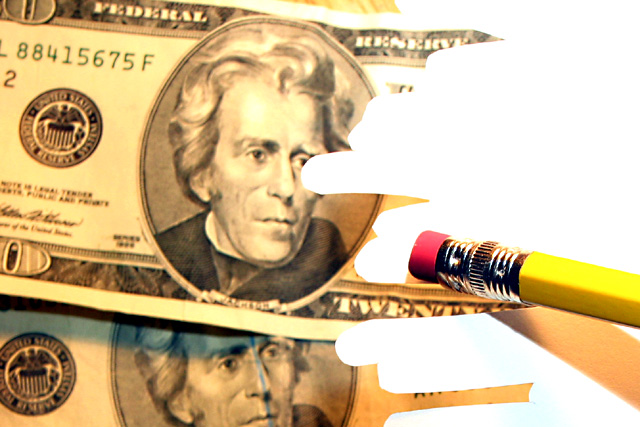
I almost did something like this myself, but I couldn't make the pencil look like it was added in photoshop. I had a photo up on my computer screen and placed the pencil in front of my screen and tried to take the photo. however, mine came out looking like a really bad dub job in an old cartoon movie. Ever seen Labyrinth? That's how mine looked. Anyway, great job in making this look presentable. I like it very much and it shows creativity and originality. lighting and focus are great. good luck in the challenge.
Now THIS is interesting photography. I not only want to know how this was done, I want to know how you come up with such a fabulous and unique idea! Good job.
From my perspective: Meets challenge:Yes Technical:good Appeal/Artistic:ok Composition:good Originality:excellent! Comments: Very origianal....congratulations! Good luck in the challenge.
Wow, this is a great trick! Since you have the admin's note, would you be so kind as to "explain" your trick after the challenge? (Is it in your photo comments?) The pencil is sooo much sharper than the bills (is that part of how this trick was done?) (I think I may have figured this one out!) 8 Swash
that's a very cool idea, and i can definitely see how you do this w/out cheating. i just wish the money was a little more in focus and didn't have quite such a yellow tint to it. other than that, that's exactly what my money usually does, it disappears w/out a trace and i wish i could figure out how to stop that ;) -- gr8photos (6)
Great effect, but somehow I wished there wouldn't be so much difference in contrast between the pencil and the banknotes. Still one of the best photos in the challenge though.
=7 and I hope you will share how you did this in a tutorial. I am going to make a guess and say you did an overlay and then took the photo. I find thelighting and distortion on the pencil to be a little distracting and a bit grainy. It is really a good analogy of what is happening to our money these days....syamjonimi ;'-D
Very nicely done. Lighting looks good. Focus is a bit soft on the money. It makes the erasure marks look just a bit funny because they are very sharp. The focus on the pencil is good. 7
The idea is clever. I'd remove the slice of table visible at the top. I can't believe that people thought this was an illegal edit! I guess you should take that as a compliment.
This is one of my favorites, I am still trying to figure out how you did this. From looking at the shadows I think that the pencil is close to the camera. That is all I can come up with though. Great photo. (9)





 Add photograph to your favorites
 Add photographer to your favorites


