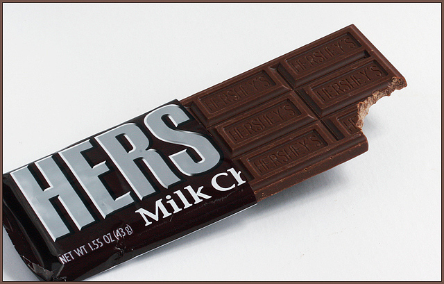
The technical aspects of this image are very good. The background is evenly light. The focus is sharp and the post processing brought out the detail very nicely. So why didn't this score in the sixes? I think there are a couple of reasons. First, the creativeness of this image is a little subtle, as the relationship between where the wrapper was cut and the title was probably lost by those voters that only looked for a couple of seconds then clicked on the 5. Second, the composition of the image is pretty good but the cropping of the left end of the candy bar falls into the personal preference category and is reason enough to vote 5 instead of 6 for many voters. I also agree with the comments regarding the cutting of the wrapper instead of tearing it. It just doesn't look natural. Overall, a good image that scored well, creative idea that could have scored higher with a different execution.
Feel free to PM me if you have any questions regarding this critique.
Thank You to everyone. I was so proud of this pic!!!!! To answer one of the questions, "How did you get the end elevated" the answer is I simply put a little thing under it to make it elevated! Special thenks to admart01 who I could never have done this pic. without, atupdate who critiqued this picture and SandyP one of my favorites who always gives me a great comment!!!!
Nice Idea, but the bite would have been nicer if it was the traditional half circle. Also, by cutting corners it distracts from the overall image. Lastly, I think the whole bar should be raised and not at an angle. it would have given a stronger feel. Other than that, Everything looks nice, very nicely captured.
Great concept...and VERY true in my world as a teacher. There's nothing better than a bite of chocolate when the students have tapped your last nerve, which is why I would have liked the title to appeal to a larger audience, not just for the broken hearted - but still, title is not enough to vote down; what bothers me is the calculated tear of the wrapper.
Just for giggles...I don't open presents that neatly, let alone a chocolate bar! LOL
I really like how you cut the wrapper at "Hers". I think I want to see a little more of the rest of the wrapper (a bit more white around the edges)...or a little less, if that makes sense. The crop just feels a little off.
really like the color and composition except that the bar is touching the left and bottom sides of the image. would it be stronger if it were entirely in the image? not over sharp like a lot of images nowadays, really good job.
i like the idea, alot, but i mean think about how no one would cute the rapper like that when they are eating a bar of candy.... its just not realalistic.
i would actually have preferred a less leading title. maybe, "Use PRN for PMS". 'course, some would have gotten mad at you for that :) also, the package doesn't look very natural...did you cut it? oh...i just got the "hers" part. nice lighting, love the soft shadow and angle.





 Add photograph to your favorites
 Add photographer to your favorites


 Photographer found comment helpful.


