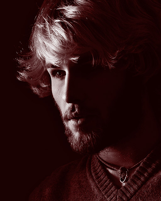
This is beautiful. I am not voting, but I'm leaving comments on the images that move me for whatever reason. Effective use of light, great exposure control, and significant emotive impact. Not sure about the red duotone being actually "red" in the challenge sense of the word, but I'm not voting anyway so it's neither here nor there. Great image. Congrats! :)
This is an incredible, beautiful portrait...and I do see a hint of red. But this would have done AWESOME in the LowKey challenge! I have to mark you down for the lack of red.
I don't believe I have ever seen a portrait (before this one) that used a Dark Crimson filter over B/W, but it certainly works here in an amazing way! Snaps for innovation,"thinking-outside-of-the-box," and for boldness and courage! Great Job! :)
I like the lighting in this portrait. Gives him an edgy, almost 18th century look. The red is so dim it almost takes on a sepia look. I wish we could choose the background color of the page our entries appear on. This one needs black I believe. Very nice.






 Add photograph to your favorites
 Add photographer to your favorites


