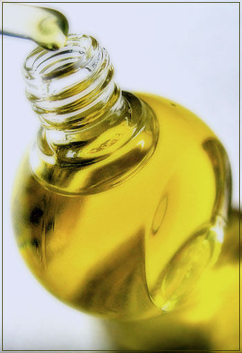
I like the limited number of colors, the simplicity. Also I like the shallow depth of field and the focus on the top of the bottle, it makes it special (you probably get a lot of complaints about it). Only disturbing are the darker streaks (caused by refractions?) in the bottle, is it caused by the label, or is the environment not shielded of for example by a white sheet ?
It's a little too bright at the top but I like it. Mainly because that's one of my favorite sayings when it comes to stink juice. I like your choice of dof except the dropper. I would have liked to see that sharp also.
Nice angle. Simple color scheme is nice. Perhaps there could be a little more definition between the bottle and its refelction at the bottom, but this is a good shot.
What appears to be a soft focus works well to give a dreamy effect. The unusual angle helps give it some interest, and follows a commonly used advertising style. The color is good and there are no obvious light reflections in the glass. Very nicely shot.
I like this very much but wish the focus were sharper. I can't tell what point in the image is focused. If the whole thing is intentionally soft, that's fine, but it seems like the droplet and/or the bottle threads should be sharper to emphasize the strength of the scent. The base of the bottle also disappears into its reflection for the same reason, making it appear to be a taller, hourglass-shaped bottle.





 Add photograph to your favorites
 Add photographer to your favorites


 Photographer found comment helpful.


