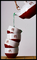
I didn't really have much inspiration for the challenges this week but I thought I could get some nice colours with this idea. I've gone with a slightly overexposed look on purpose as I think it adds a feeling of life and vitality, qualities I presume Dandelion Tea may provide? I don't drink Dandelion Tea, I never have.
The "tea" is just water with green food colouring in it. I thought that the combination of blue, green, and yellow would make for a nice image. The background was white card but seems to have picked up the blue from the mug somehow (I must try and work out what the story is with that?) but I like it in a lot of ways so haven't tried to fix it.
I worry a little about DNMC with this as Dandelion Tea isn't a major player in the Alternative Medicine arena. I'm figuring that the challenge topic is one that most voters will accept anything that is close to alternative medicine...hopefully ;)
Editing Steps: Convert from RAW
* Exposure -0.10
* Shadow contrast +18
* Saturation +100
Rotate
Crop
Curves
Levels 5, 1.66, 234
Contrast +8
Resize
USM
Add border
Save for web
Statistics
Place: 6 out of 131 Avg (all users): 6.6716 Avg (commenters): 7.5000 Avg (participants): 5.9792 Avg (non-participants): 6.8206 Views since voting: 2409 Views during voting: 390 Votes: 271 Comments: 33 Favorites: 2 (view)
First, let me start off by offering my congratulations on your 6th place finish. This is one of the easiest critiques I've been assigned in a long time, as your comments mentions all of the tripping points this image has regarding scores at DPC, over exposed, blue pickup in the background, and the food color green of the tea. Overall, the image offered a good visual tie to the challenge and was well received, as you can tell by the score. My opinion is that when an image makes it into the top ten, the placement within the challenge no longer rides on the image quality or the technical aspects but the mood of the voters and the personal taste of those that actually votes that challenge. Nicely done and it looks good on the front page of your profile.
Feel free to PM me if you have any questions regarding this critique.
nice colours, nice idea. I wish there was just a touch more dof (though I do agree with you that keepong the dof relatively shallow was right for this). Overall, really a great shot.
This is very cute, but, I don't care for the placement of the cup in frame. I think if the cup was more towards the left edge as you are looking at it and there was a lot of whitespace to the right it would have been fantastic.
I really like the colors used in this photograph. It could be a little clearer, but the bright yellow to the dandelion makes up for that, it just pops out from the background and makes the photo very pleasing to the eye. Nice job.






 Add photograph to your favorites
 Add photographer to your favorites


 Photographer found comment helpful.


