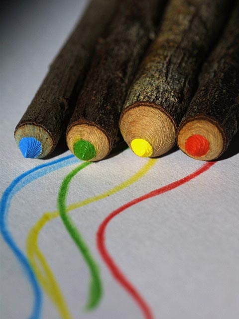
I liked this photo. It was in my top 20 for the week. I liked the way the focus softened on the edges. I liked the slight angle of the pencils and the texture in their points. The only thing that nagged at me was that the lines were not aligned to their respective leads. Nit picky I know, but it made a difference to me. Overall, 7.
Interesting idea, and nifty pencils. I would have given higher marks if the lines drawn actually met the leads that drew them. Green comes closest, then yellow ... but red's line is far from the lead -- and blue's is going to a different pencile altogether!
COOL This is great. (I'm running out of steam for commenting - so being brief) I like the composition and the entire idea; different; sot of a spotlight usage; texture of paper, detail - all great characteristics of this image. Great Work 9 Ruthann
I really like this and the DOF used. Only thing is that dark shadow at top left. I'd like to see the full width used by the pencils across the top. Would also like the lines of colour to come out at just the right place - like the green one. The blue one seems to come out from under the green pencil. Do love the colours and the textures on the pencil tips too. 7, Kavey
Although I've seen pencils like this before. I wonder if they are real pencils or made that way, as sticks sharpened and painted. Either way, very nice effect. Creative and original. The lighting is good and the focus is nicely on the tips. Only one thing particularily stands out to me in this photo. The red, green and yellow lines all lead right up to the matching pencil, but the blue line misses the pencil completely. Great idea and beautiful colors. Good luck in the challenge.
Composition - very good Technical Aspects - very good Meets Challenge - yes Visual Impact / Originality – high Other suggestions – alignment of lines with points would have been great ( but tough)
This is kind of neat and I'm wondering how you did the "pencils" or if you found them in a shop somewhere. Obviously the blurring at top and bottom is intentional to bring the focal point into sharper view, but I'm not sure I like it... it makes my eyes go funny. Good picture though
Very interesting....I would have completely overlooked the bark on the outside of the pencils without the title though. I really like the artistic touch and the center focus.





 Add photograph to your favorites
 Add photographer to your favorites


