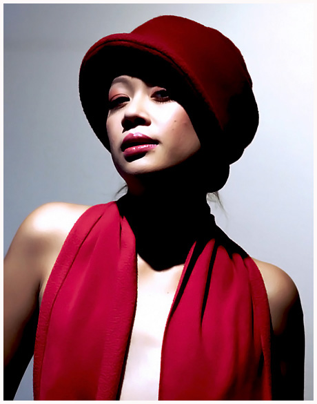
WOW. I guess I'm not surprised about the majority of comments, but I totally find the contrast and harsh lighting to work REALLY well. It's different. It's fun. The lighting gives a fashion/editorial feel. I can see this is a magazine. I really love what you did with it. I had given it a 10.
I am drawn to this originally I wasnt fussed with it but it grew on me Maybe the shadow area is somewhat too dark for my liking but it is a stunner the top right corner to me would also needs brning in
The posture and comp look like it could be in a magazine, but the first thing I thought of when I saw the picture was how blown out part of her face was, then the same on her chest. I think if you fixed that you could be onto a winner though.
Great use of lighting.
Nice crop, good choice of background colour too - really makes the colours stand out.
Superb skin tones and great soft textures on the red elements.
10.





 Add photograph to your favorites
 Add photographer to your favorites

 Photographer found comment helpful.


