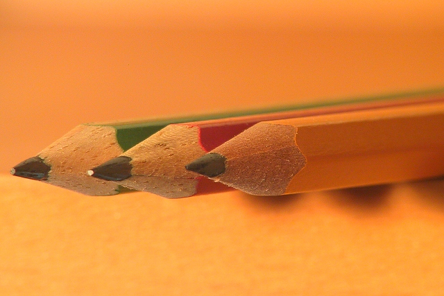
three pencils. cropped and sharpened. no other post-processing. last minute (literally, taken less than an hour before midnight on sunday) entry ... those usually don't do well. but i kind of like the shot :)
Statistics
Place: 45 out of 185 Avg (all users): 5.8439 Avg (commenters): 6.6538 Avg (participants): 5.9398 Avg (non-participants): 5.7500 Views since voting: 1175 Votes: 269 Comments: 27 Favorites: 0
thank you all for your comments, as usual. the three pencils are lying on the upper shelf of my desk at home, sticking over the side of the shelf, hence those shadows. i liked the way the yellow pencil fades in with the background, but realize from the comments that people either love it or hate it. oh well. i have taken a couple of shots with a white background and having the pencils enter diagonally into the shot, but it just didn't work as well for me.
it was pretty dark, so i hand-held a desklamp, that was all the light i could muster at that time of night. hence also the reflection on the pencil tip (which i noticed only after uploading the pictures).
lastly, i included the yellow pencil (rather than going just with primary colors) because i still had this yellow pencil thing in my head from the initial challenge description, as well as because it did blend so much with the background ... i wanted it that way! ;)
Very good use of the narrow DOF to focus on the pencils. The shadows below the pencils are a bit distrating because it's not visible if the belong to the pencils or something else. -stephan
Composition, sharpness are good. It's simple and direct. The shadow is nice. Maybe it's just me, but there seems to be too much yellow. A different color in the background would probably make it more appealing to me and make the subjects "jump" out a little more. Not white---but something with less yellow.
I like the variety of colors, the subdued background, the hint of shadow. It's sharp without being over done. In short, striking and dynamic. well done. 9
Nice composition and I like the effect of the DOF. Would have like to have seen the colors of the pencils "pop" out from the background a little more - perhaps a tiny bit more light on them. lhall
Composition - quite good Technical Aspects - quite good Meets Challenge - yes Visual Impact / Originality – high Other suggestions – did you try a whiter background? Probably would have set pencils off better.
Simple but very nice. The clarity is great on those tips. I like how it fades away with the green one in the back. Lighting is great and the colors are very nice. I was kind of wondering though, why you used 2 primary colors and 1 secondary color? yellow, red and blue would be the logical combination of colors, but maybe how you have it, it was a better visual combination. I wasn't saying it was a bad thing, just wondering if you did it that way on purpose or not. Great photo and good luck in the challenge.
I enjoy this shot but I think the background color is somewhat distracting. Don't get me wrong -- I'm a fan of backgrounds. But the color of this one is just too similar to the yellow pencil...I think it detracts from the focus of the shot. muckpond
Wow...excellent focusing! The only thing is that it looks like there is a little bit of a reflection off of the point of the center pencil which is a bit distracting. Maybe play around with the order of the pencils as well..the yellow being in front along with the yellow background perhaps is not as visually stimulating as the red one being shown more for some contrast. Good job and good luck in the contest! KrazyKat





 Add photograph to your favorites
 Add photographer to your favorites


 Photographer found comment helpful.


