Author Thread Comments Made During the Challenge
Post actions
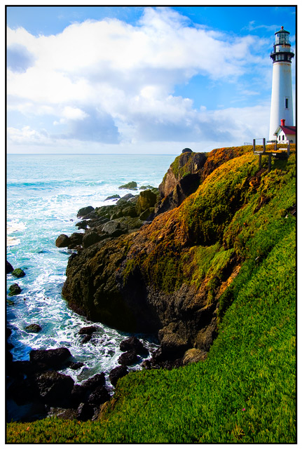
I really like this this photo. I feel the lighthouse is too close to the edge of the frame and would have benefited a bit further away but I still think this is a nice capture. good job
Post actions
I would score higher if the light house was not so crammed to the edge.
Post actions
WOW...lovely colours and clarity..9
Post actions
Nice capture - Love the tones just wish the lighthouse had a little more breathing space
Post actions
Beautiful shot, the colors are incredible and the composition is right on. Well done.
Post actions
Beautiful colors and clarity, but IMNSHO, you need to get the light house in or out of the shot -- it's too close to the margin.
Post actions
the colours seem a little too vibrant (over saturated?) to me. Sorry if you didn't adjust in PP
Post actions
Beautiful colors and clarity
Post actions
I like the composition with the lighthouse not being dead center. I would have maybe given it just a little more room on the right side. It almost looks "chopped off".
Post actions
I wish it wasn't cropped so close to the lighthouse.
Post actions
Wonderful rich colors! Nice composition.
Post actions
Did you saturate the sky? It looks too blue on the right. Maybe I just live in a polluted place.
Post actions
This looks like a postcard - I really like the processing.
Post actions
The tones in this are really nice. I think I'd like the photo a little better if the lighthouse wasn't so close to the edge of the picture.
Post actions
I like this a LOT... I can't help but think that the lighthouse needs just a teeny bit more breathing room on the right, though. I might have panned just a little more to the right. Still a darned fine shot, though :)
Post actions
A bit too bright for my liking (but what do I know?). I would've like to see more behind the lighthouse.
Post actions
IMO it needs a little more space to the right of the lighthouse.
Post actions
It's a little tight on the right, I'd like to see a bit more space beyond the lighthouse. Clouds are a bit blown out but overall a beautiful scene.
Post actions
the cropping on the right seems uncomfortably close to the light house. Beautiful colors and balance of negative and positive space.





 Add photograph to your favorites
 Add photographer to your favorites


