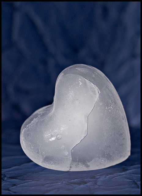
I really like the theme here. It is well constructed and thought out. However, there are several area where this does not come off well in practice. I don't like the lighting on the ice. The front lighting on the image does not show off a lot of detail in the icy heart. Trying some additional shots with the lighting and different angles to the camera would likely be worthwhile. Also, this image is crying out to be cropped in a very different way - the negative space at the top is almost lost space. I would recommend either cropping it square right around the heart or making the image much smaller in the scene and have substantially more negative space.
Just my two cents! |




 Add photograph to your favorites
 Add photographer to your favorites

 Photographer found comment helpful.


