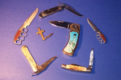
Forgive for mispelling the title of this one I know its knives! Ok What was I thinking, I wasnt! Propaganda was hard enough to understand then I got the flu when it was challenge deadline, and I guess my heart was in the right place just everything else of me was out the door. So what was I thinking? I hope I am not the only photographer that has one of these!
Statistics
Place: 132 out of 133 Avg (all users): 3.7040 Avg (commenters): 3.5000 Avg (participants): 3.5072 Avg (non-participants): 3.7922 Views since voting: 1087 Votes: 223 Comments: 8 Favorites: 0
A nice assortment of knives, artfully arranged. The gradient background is nice. The focus is too soft for the subject; it needs some sharpening. But your interpretation of the beauty and variety of knives is too neutral to be propaganda.
What?? What do knifes have to do with propaganda!! I see a cross and satue of liberty, but the if that's the point, it's not nearly strong enough because of the other knifes. Just my 2 cents.
I can see that you are attempting to better your studio shot skills. Few things. When using a single light you get hard shadows. Try a fill light on the right, or a white reflective surface to fill in the hard shadow. If your camera has a manual white balance setting, you need to learn how to use it, or set the white balance for incandesent lighting. You're yellow tone is a result of improper white balance. Your image is also rather small for viewing on the web. Save at 72 dpi with the longest side being 640 pixels. This will give the viewer a better chance to make out the details on the handles. Lastly, your presentation is not too exciting. Try picking just 3 of the most interesting knifes and organize them in a different way so as to bring out the most from each of them. Also, get in closer to your subjects, providing your camera allows for a closer in focus. 4 -danny






 Add photograph to your favorites
 Add photographer to your favorites


 Photographer found comment helpful.


