Originally posted by nshapiro:
 |
Positives:
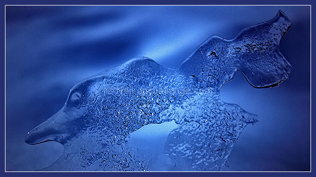
Great choice of blue tones. General overall technical quality is good. Tonality is nice.
Technicals:
The image contains a few white specks that should be cloned out. Unsure but think that would be allowed in basic editing now. It is slightly oversharpened, but not much. The interior of the 'porpoise' has some oversharpened spots. Lighting is OK.
The challenge:
Meets the challenge. That is no problem. Your assumption that voters would see the 'porpoise' and vote it higher as a result is probably in error and explains why it scored lower than you thought.
Suggestions:
Clone out the white specks. The brightest areas of the interior of the 'porpoise' should be toned down. Unsure if this is possible in basic but reducing overall sharpness would help with this. Overall composition is not bad, but you might want to experiment with other framing to see if it 'looks better'. |





 Add photograph to your favorites
 Add photographer to your favorites

 Photographer found comment helpful.


