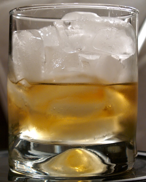
I'm surprised this did not score higher. It is a good pic. And except for one, you got some really good comments there. For something like this where you are playing with the lighting, try adding a solid background and see what happens. should be an interesting effect. I didn't get to vote on this but i would have given this a 7!
The setup is a lil distracting, like the edges (of a table?) on the bottom left and the light band on the top right. The image wud have looked better if the cubes on the top were well formed and sharp
I would try and keep the other things, the tray under the glass and background as simple as you can, and perhaps add a bit of negative space to avoid filling the frame with the glass. Maybe a different angle than straight on would be appropriate for this kind of shot. Focus and colors are good though ;) keep it up.





 Add photograph to your favorites
 Add photographer to your favorites

 Photographer found comment helpful.


