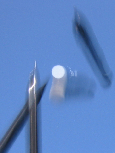
free fall mechanical pencils, outside on a clear day. 1.3x zoom and about 1/4 of the orignal picture: //umsis.miami.edu/photos/dpchallenge/submissions/images/pencilORIG.jpg
Statistics
Place: 183 out of 185 Avg (all users): 3.5328 Avg (commenters): 3.5000 Avg (participants): 3.5075 Avg (non-participants): 3.5600 Views since voting: 1298 Votes: 259 Comments: 25 Favorites: 0
Sorry cq107. I really wanted to empathize with you. You sounded so disappointed with your average. So, you tried something new, and people didn't respond well -- isn't that part of the learning process? Not trying to preach. I know how it is to be disappointed with your placement. But you said in the chatroom that you're discouraged from doing anything creative or different in the future - I hope it's not true.
BLURY, blah who cares, this is diffrent and creative, I felt that NO one would attempt such a shot , and sure enough I was right. Its a shame that only 32 or so peple understood what they were looking at. The white thing in the middle is the tip of the eraser. As for the motion blur, I challenge anybody to recreate this shot and acheive such an image :) I messed up the URL for the original at the top, here it is (big diffrence): //umsis.miami.edu/~jjuroch/photos/dpchallenge/submissions/images/pencilORIG.jpg
You have a very nice background for this photo. Pretty blue. THe lighting and angle are great, however, I'm kind of curious, as the motion blurs for the eraser and the upper most pencil are going 2 different ways. I'm really don't know much about motion blurs, so you can ignore that if you want. The eraser stands out nicely being in the center of the photo. There is a slight glare on the vertical pencil, but it's not distracting from the photo. Honestly, it's not something I'd hang in my livingroom, however it is nicely done. Good luck in the challenge.
Great idea! Love the action of this shot, just wish I could see it. I think I see four elements in this photo. Three seem to be mech. pencils, what is the fourth item? I think it has a white cap. IMO, too much blurrrr. Suggestion: use a more textured background and move the camera with the dropped items. That would blur the background for your sense of motion, while attempting to preserve your subject's viewability. But if blur is what you want, you got it! 7 Swash
I do like some blurry movement shots, but this one is so blurry I wouldn't have a clue what was in it if I didn't know. It's just not grabbing me. That said, I do like the white circle that's captured so well in the centre. Kavey
i have to admit, if this wasn't an entry for the pencil challenge, it would've taken me a while to figure out that i was looking at pencils. what's the white thing in the middle? i like the background color, and the grayish pencils against that, but was there a way to stop the motion a little more to make it not quite as abstract (of course, that's probably exactly what you are trying to achieve ... don't you just hate it when people don't appreciate what you worked hard for?). but, the truth is, deliberately abstract or not, to me, the photo isn't that appealing, sorry. -- gr8photos (3)





 Add photograph to your favorites
 Add photographer to your favorites


