Greetings from Critique Club!
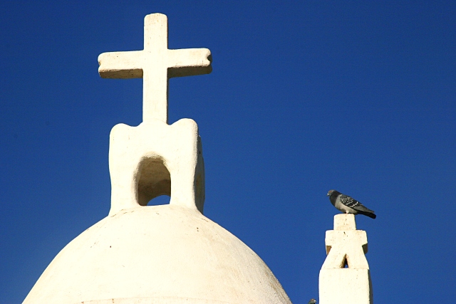
I gave this a 6. Really it was a 6 and a half, very close to a 7. I like the simplicity of this image. The "lost" details and "blown" highlights on the church work nicely, imho. My only problem with the image is the pigeon, actually. I just want him to be a bit more vivid, or stand out in some way. Is that a shadow on his neck? I don't like that much. I also wonder if a square crop might have accentuated the iconic quality of this image.
Nicely seen and captured. Thank you! |







 Add photograph to your favorites
 Add photographer to your favorites

 Photographer found comment helpful.


