|
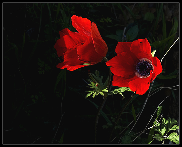
My reaction to this shot was I think based primarily on the effect the colors had on the light in the image. They look bright, but really the whole thing seems bright. I'm not one to say that low key has to be B&W, but the red really exaggerates (at least to my eyes) the overall brightness it. This to me seemed bright overall (even with the background darkened as it was) to be low key. I did a quick conversion to black and white; do that and take a look, it might help you see what I think I was seeing in the color version. The histogram might help, too; it shows a spike at the dark end and then pretty level across the rest of the spectrum. Not definitive, but says something. I hope that helps a bit, sorry for rambling on. |






 Add photograph to your favorites
 Add photographer to your favorites


 Photographer found comment helpful.
