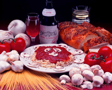
Had a hard time getting the image to look right on the site and settled for this. Not enough time to keep playing with it. I don't know if I am doing something different, but this is the biggest I could enter again this week. Sorry that it is so small. If you see little spots on the tomatoes, it is water drops, they were put there intentionally.
Statistics
Place: 76 out of 133 Avg (all users): 5.0746 Avg (commenters): 5.1765 Avg (participants): 4.8382 Avg (non-participants): 5.1750 Views since voting: 1268 Votes: 228 Comments: 19 Favorites: 0
Greetings from the CC, seems like lots of folks think this is more advertising, but I will look more at shot itself, taking 'challenge topic' considerations out. I find the shot too small for one and very busy for a small space. It feels very crammed, making my unsure of what to focus on. I think a simpler less busy compostion may have served you better. I don't find the glass in the background at all neccessary, nor the slices of bread on the right side. The garlic on the left is a little overexposed. I wonder if you would try reshoooting with less objects and see if it comes together a little better. I do like the way that the uncooked spaghetti is presented on the table, and the plate of spaghetti itself. Perhaps these, and the wine would be enough to work with.
I think your idea is good, keep playing with it, maybe next time give yourself a little more time : ).
Hope it is helpful, if not disregard and keep up the good work : )
lynn CC
p..s. if you reshoot them send them to me if you like and i will have a look.
I thought that propaganda could be any kind of advertising. Oops. But thanks for the votes that were as high as they were considering I didn't meet the challenge :)
Not sure it is propaganda, but it is sure a nice advertising shot. I like the pasta leading the eye into the shot, the balance of red tones composed throught the image, contrasted by the white ingredients. The black at the back is a bit to strong in my opinion, a nice brown tint would have complemented the image better I think. And the bottle should not have been cut at the top. Or maybe getting closer, leaving out more of the black (and cutting of more of the bottle, glass etc.) could have solved it.
I really like this shot. I feel it'd have been a great image for the recipe challenge, but the size would inhibit from being rated too high. When saving for the web save at 72 dpi and 640 pixel on the longest side. 5 -danny
Advertising is a form of propoganda, and this looks delicious. Nice array of textures, although a bit soft; some sharpening would help them stand out more. Something green (a salad?) would have made a nice allusion to the Italian flag, but there is certainly plenty there without it.
I'm hungry! I know that advertisements propigate some information but I'm not that it is exactly propaganda. I will vote according to the shot only since I cannot decide.
The photo meets the challenge very well but the title makes it more like an advertisement and not propaganda. A title like Eat Italian would suit the photo and the challenge better. BTW I really like how you set up the scene; great work!
Beautyful still life. I´m turning hungry! But I´m not so sure that it is propaganda. The DPC forums had many discussions about to be or no to be propaganda. The conclusion is that propaganda don´t sells anything, only cause changes in the way that people see something. Classical samples are the war´s benefits anouced to promete it, between others.






 Add photograph to your favorites
 Add photographer to your favorites

 Photographer found comment helpful.


