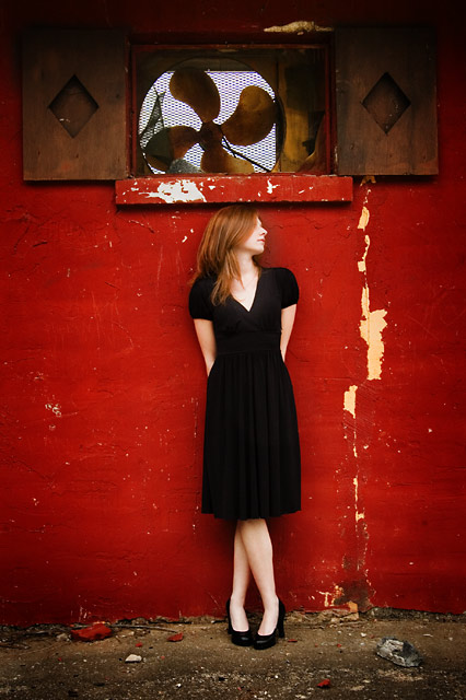
fantastic hues and softness - the composition seems a tad off and a smidge slant but the general vibe here is great - love the fan, textures and colors.
Is this reference to the fashion brand? I really like this alot, the textures with the model work really well...her pose looks a little stagnant but here it really works. Great photo
Nice image, but I would have voted higher if she was off-center (to the model's right), putting more space to her left. That would give her enough space to "look in to".
Isn't that a designer brand name? Or does DKNY mean something else in this context? (ETA - looked it up, Donna Karan New York) :D Interesting location for the shoot, it's edgy and the red color works well with your model. Overall, it's a nice photo. Good luck in the challenge.
Very cool shot. This would also have been great for the Red challenge ;-) I'm not sure about her head sort of touching the window sill, would have preferred to have been standing to the left or right of the sill (tiny nit-pick).
What a lovely photo. I absolutely love your choice of backgounds that complements her red hair. I don't know anything about Donna K or fashion or even if this meets the challenge, but this is a fantastic photo.
I like this picture (where do you guys find these reds???). No idea what DKNY means, but you probably had something in mind ;)... Update: While browsing this challenge with my wife she knew right away what DKNY means "Donna Karan New York, of course!" - 8!
I really like this shot. The colors, composition and textures are great. I love the way it looks like she's balancing the window on her head! Also, I am a big fan of peeling paint. Great job.







 Add photograph to your favorites
 Add photographer to your favorites

 Photographer found comment helpful.


