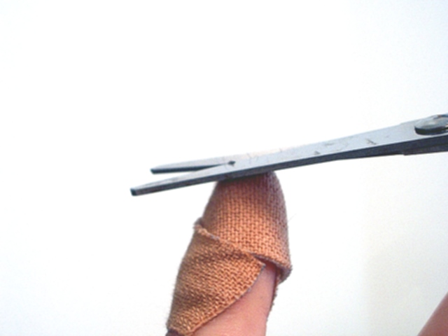
I'm not really clear on what you were going for here... I think maybe you meant to put this in literalisms and not in propaganda? I'm going to comment on it though, what I like, and what could be improved. I like the uncluttered, plain, white background... it definitely adds to the photo. I do not like your placing the main part almost perfectly centered... use your rule of thirds! I would crop off a substantial amount of white from the top and the left, placing the subject in the upper left hand of the photo. I like your use of texture in the bandaid, next to the smoothness of the scissors. I'm bothered by the showing of the skin in the bottom right. Hope you find these comments useful.
this is rather impressive... there are somethings that could be done to improve the quality of the image, but this just shouts BENETTON commercial to me.
well done.
Perhaps it is me but I don't understand what you are trying to say with this photo. I like the negative space a lot. It is a pity the focus is a bit off.





 Add photograph to your favorites
 Add photographer to your favorites


