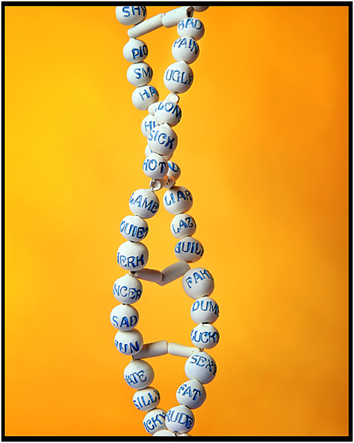
So I spent a goofy number of hours making polymer clay balls and stamping words with alphabet rubber stamps. Then I baked them along with some "rods" for the center sections. Another hour or so figuring out how to wire it all together in a way that will keep it all flexible.
I taped in place between a broom handle and the studio floor and started figuring out the lighting. Too bright was boring, too dark confusing, too colorful distracting, etc, etc, etc,. 1 day of prep, 3 shooting sessions, and a good deal of "experimenting" in PS to find just the right processing for it.
Hope it shows well. :)
Statistics
Place: 24 out of 201 Avg (all users): 6.2805 Avg (commenters): 7.4167 Avg (participants): 6.0789 Avg (non-participants): 6.4545 Views since voting: 1577 Views during voting: 315 Votes: 164 Comments: 16 Favorites: 1 (view)
Sweet concept. And you're ever so crafty!
Nice pairing of colors, the blue text goes well with the orange/yellow background, which itself looks great too.
Cute, and I recognized the acronym immediately! Hooray for that. I like the color choice you selected for the background. The bottom border is a little distracting as it's twice as wide as the sides. Just an observation. Good luck in the challenge.





 Add photograph to your favorites
 Add photographer to your favorites


 Photographer found comment helpful.


