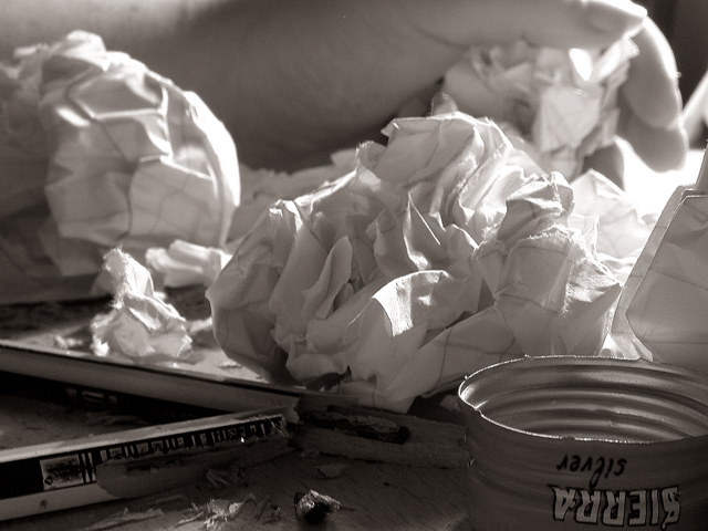
I feel your pain. lol. This is a very nice photo. I like the fact that it's in black and white, but would like to see the color version also. The lighting is good. The pencil is kind of in a shadow making it not stand out right away, but no one ever said it needed to stand out, right? I like the angle of this and the focus is in a perfect spot. Great job and good luck in the photo.
I like the lighting and the tone and 'mood' provided by this photo... the 'pencil' presence is slightly weak though... Since the pencils exist in the shadows, I had to look for them and then determine if they were pencils or not :) This is good work :) - 7 - jmsetzler
This is a great photo. I thought when this challenge topic came up that most of the photos would be studies of pencils or some other kind of static shot that doesn't really express anything, and I was right! Your photo is a lot more engaging because it uses the pencil as a springboard to explore an emotion. The duotone is great, and I love the textures and shapes of the scrunched up paper :).
I tried, but just don`t get it... If this relates to the challenge of pencils, you need to let that stand out more... Perhaps that is pencil shavings at the bottom, but difficult to tell... If you had fun making this... that is what counts!
great shot. very nice coloring. would love to know what color you used. i assume this is a duotone. i love the lighting on this. i do have a cropping suggestion. if you would like to hear it let me know. 9. goodtimecharlee
nice concept, b&w works well here. overall, the photo is a little too busy for my liking. the pencil in the foreground is definitely not the first thing i see, and it took me a moment to notice the hand. the bottlecap on the bottom right doesn't really fit in in my opinion. i think if the foreground was a little lighter, more of my focus would be there. -- gr8photos (3)
A little too dark. It could be simpler with just broken pencil and a couple balls of paper, or alternatively I want to see more, what is the tin? What's being written? (Just my opinion) Kavey
I had this VERY same idea... almost exactly! Glad I went with something else, this is kind of depressing. But the photo is good. B&W gives it an even more stark and depressing effect.
Technically meets the challenge, but I do think this picture has much to do with a pencil. It's more about the crumpled pieces of paper. Interesting study in focus. I like it.
I like the composition of the shot a lot. It wants to be one of my favorites of the week, but these's so much light in the center compared with relative darkness now by the pencil. At first I wanted to say boost the contrast, but that would only darken the pencil and lighten the paper. Perhaps shifting the lighting a bit. Still, 8 for now and I'll have to look again during the week.





 Add photograph to your favorites
 Add photographer to your favorites


