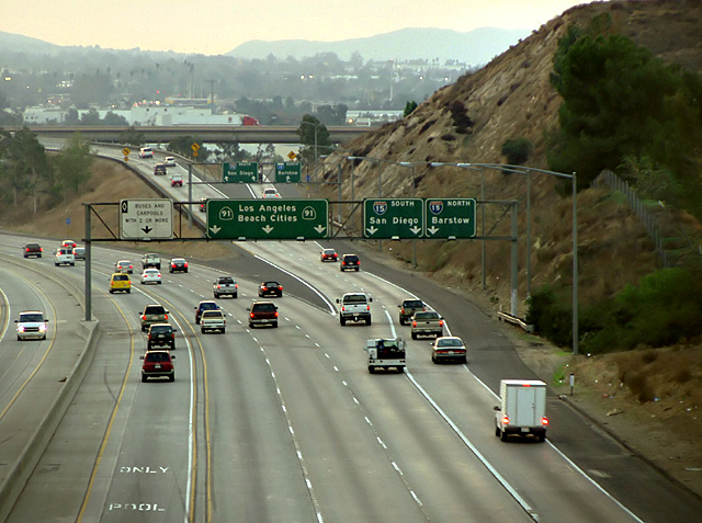
Thanks to all for your comments. In hindsight, it's obvious that my message here is too subtle to be good propaganda. I wanted to get blurred cars, but the fence on the overpass I stood on had holes too small to use a tripod, and the fence itself moved too much to brace the camera against.
this is an intersting idea... I like the representation of choices thru the street signs. Perhaps if the signs were more focused the shot might be even better.
i'm sorry, but i don't see how this fits this challenge.
There is too much "dead space" in the foreground of this picture. a tighter crop might have helped focus on a subject. right now, i am not even sure what this is supposed to be a photo of.
this reminds for the shot i once made and titled it "clearly, we had options..." - but for the life of me i see absolutely no connection to the topic... as a picture standing on it's own merit it doesn't appeal to me either, sorry...
I think I took the 15 North when I was suppose to go South, when I visited there in June. All them mountains made me confused. Overall though, I'm not sure I see how this fits propaganda. 5 -danny
Composition is average here. The signs are the obvious subject, but wise choices are not apparent (neither is the opposite). The message is not presented very well here.






 Add photograph to your favorites
 Add photographer to your favorites


 Photographer found comment helpful.


